1. 위젯
플러터에서 모든 것은 위젯으로 구성된다.
화면에 나타나는 텍스트부터 버튼, 상태까지 모든 것을 위젯으로 구현한다.
위젯은 다른 위젯을 자식으로 받을 수 있고, 이러한 과정을 통해 일종의 위젯 트리를 만들어낸다.

위의 예제를 보면 위젯1 밑으로 3개의 위젯이 있고, 그 밑에도 위젯이 있는 것을 확인할 수 있다.
위젯 2,3,4는 위젯1의 자식 위젯이고, 위젯 5,6,7은 각각 위젯 2,3,4의 자식위젯이다.
이렇듯 flutter는 위젯이 서로 모여 프로그램이 만들어진다.
2. 여러 종류의 위젯
앞서 여러 위젯이 모여 하나의 프로그램이 만들어진다고 했다.
그런 만큼 flutter에는 많은 종류의 위젯이 있다.
지금부터는 여러 종류의 위젯에 대해 살펴보도록 한다.
위젯에 대한 내용을 공부하기 위해 기본적인 틀을 미리 잡아놓는다.
저번 글에서 배운대로 프로젝트를 생성한 후, main.dart에 다음 코드를 집어넣는다.
(저번 글 참고)
2023.06.19 - [단기 프로젝트] - 프로젝트1_1. Flutter 개발 환경 구축하기
import 'package:flutter/material.dart';

void main() {
  runApp(const Example());
}

class Example extends StatelessWidget{
  const Example({Key? key}):super(key: key);

  @override
  Widget build(BuildContext context) {
    return MaterialApp(
      home: Scaffold(
        body: Center(
          child: Text("Test"),
        ),
      ),
    );
  }
}
위 코드에서 child: 뒤에 widget을 넣어 테스트한다.
지금은 코드에 대해 상세히 알지 않더라도 괜찮다.
2-1) Text Widget
Text widget은 단순히 텍스트를 표시하는 위젯이다.
위 코드를 그대로 넣고 테스트하면 다음과 같은 화면이 뜬다.
화면에 테스트라는 글자가 뜨는 것을 확인할 수 있다.
텍스트에 스타일을 입히기 위해서는 텍스트 위젯 안에 "style" 파라미터를 넣어준다.
다음 코드를 child 안에 넣어준다.
child: Text(
	"Test",
	style: TextStyle(
		color: Colors.lightBlue,
		fontSize: 30,
	),
),
style 안에 TextStyle 위젯을 넣어주고, 그 안에 꾸미고 싶은대로 코드를 넣어준다.
color는 텍스트의 색을 지정하고 그 값으로 Colors.lightBlue를 넣어주었다.
Colors는 여러 색이 있는 클래스이다.
Colors. 뒤에 색 이름을 적으면 그 색이 뜬다.
자세한 사항은 아래 링크를 참고하면 좋다.
https://api.flutter.dev/flutter/material/Colors-class.html
Colors class - material library - Dart API
Color and ColorSwatch constants which represent Material design's color palette. Instead of using an absolute color from these palettes, consider using Theme.of to obtain the local ThemeData.colorScheme, which defines the colors that most of the Material c
api.flutter.dev
fontSize는 글자의 크기를 결정한다.
결과는 다음과 같이 나온다.
2-2) Button Widget
Button widget은 버튼을 나타낸다.
child: OutlinedButton(
  onPressed: () {},
  child: const Text("Outlined Button"),
),
위 코드를 실행하면 다음과 같은 화면이 뜬다.
Button 위젯은 항상 'onPressed'를 넣어주어야 한다.
지금은 아무런 일도 하지 않기 때문에 onPressed 파라미터로 빈 함수를 넣어준다.
() {}는 익명함수라고 하며 이름이 없이 쓰는 함수이다.
그렇기 때문에 한 번만 사용한다.
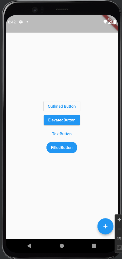
child: Column(
            mainAxisAlignment: MainAxisAlignment.center,
            crossAxisAlignment: CrossAxisAlignment.center,
            children: [
              OutlinedButton(
                onPressed: () {},
                child: const Text("Outlined Button"),
              ),
              ElevatedButton(onPressed: () {}, child: const Text("ElevatedButton")),
              TextButton(onPressed: () {}, child: const Text("TextButton")),
              FilledButton(onPressed: () {}, child: const Text("FilledButton")),
            ],
          ),
위 코드는 여러가지 버튼 위젯을 나타낸 것이다.
코드를 실행하면 여러 종류의 버튼이 화면에 뜬다.
코드에서 쓰인 Colume 위젯은 children 안에 있는 위젯들을 새로로 배열하는 위젯이다.
'mainAxisAlignment'와 'crossAxisAlignment'는 Colume안에서 위젯을 위치시키는 방법을 나타낸다.
더 자세히 알고 싶은 분은 아래 링크를 참고하시면 된다.
https://api.flutter.dev/flutter/widgets/Column-class.html
Column class - widgets library - Dart API
A widget that displays its children in a vertical array. To cause a child to expand to fill the available vertical space, wrap the child in an Expanded widget. The Column widget does not scroll (and in general it is considered an error to have more childre
api.flutter.dev
아래 링크는 버튼에 대한 내용이다.
https://m2.material.io/components/buttons/flutter
Material Design
Build beautiful, usable products faster. Material Design is an adaptable system—backed by open-source code—that helps teams build high quality digital experiences.
m3.material.io
2-3)Floating Action Button
Floating action button은 화면 위에 떠있는 버튼이다.
그렇기에 화면이 움직여도 floating action button은 그 자리에 가만히 있는다.
Floating action button은 Scaffold안의 floatingActionButton 파라미터 안에 넣어준다.
@override
  Widget build(BuildContext context) {
    return MaterialApp(
      home: Scaffold(
        floatingActionButton: FloatingActionButton(
          onPressed: () {},
          child: const Icon(Icons.add),
        ),
이렇게 넣어주고 실행하면 다음과 같은 화면이 뜬다.
오른쪽 아래에 있는 동그란 버튼이 floating action button이다.
'플러터 (flutter)' 카테고리의 다른 글
| Flutter WebView 위젯 (0) | 2023.06.23 |
|---|---|
| Flutter와 위젯(Widget) (2) (0) | 2023.06.23 |
| Flutter 개발 환경 구축하기 (0) | 2023.06.19 |
| Dart의 동기와 비동기 코딩 (0) | 2023.06.16 |
| Dart 클래스 (2) - 프로젝트1_1 (0) | 2023.06.16 |